Situatie
Once you input your data and select the cell range, you’re ready to choose your chart type to display your data. In this example, we’ll create a clustered column chart from the data we used in the previous section.
Solutie
Pasi de urmat
Select Chart Type
Once your data is highlighted in the Workbook, click the Insert tab on the top banner. About halfway across the toolbar is a section with several chart options. Excel provides Recommended Charts based on popularity, but you can click any of the dropdown menus to select a different template.
Create Your Chart
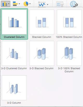
- From the Insert tab, click the column chart icon and select Clustered Column.
- Excel will automatically create a clustered chart column from your selected data. The chart will appear in the center of your workbook.
- To name your chart, double click the Chart Title text in the chart and type a title. We’ll call this chart “Product Profit 2013 – 2017.”
Leave A Comment?